The actual bell curve represents the distribution of performance ratings that employees actually receive after appraisals, as opposed to the “ideal” or expected distribution set by HR. It shows how managers have evaluated employees in reality.
- Real distribution of ratings given by managers, which may differ due to appraisal biases or evaluation styles.
- Identify deviations in rating patterns.
- Ensure fairness and consistency through normalization.
- Support accurate decisions for promotions, increments, and variable pay.
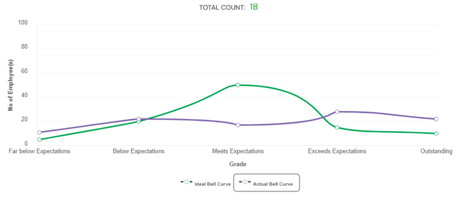
Example:
Ideal Distribution: 10% top performers, 70% average, 20% low performers.
Actual Ratings: 30% top ratings, 60% average, 10% low ratings.
This difference highlights the need for normalization to align actual ratings with the expected distribution.
The actual bell curve is a reflection of how employees were truly rated. Comparing it with the ideal curve helps organizations maintain fairness, objectivity, and transparency in performance evaluation.
PS: Synergita implementation for your Organization may vary from how the features are described here. The screenshots given here may also be different from what you see in your system. Please talk to the concerned person in the Organization for any specific queries.